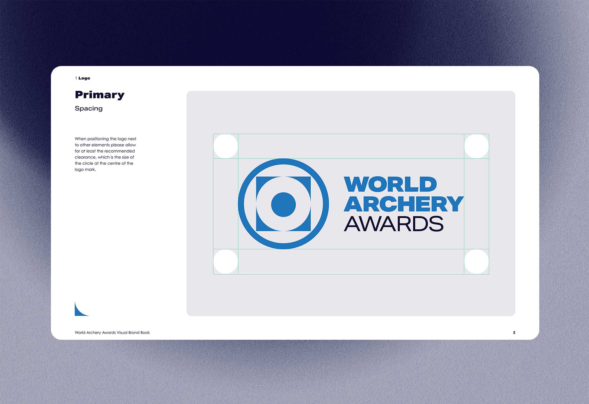
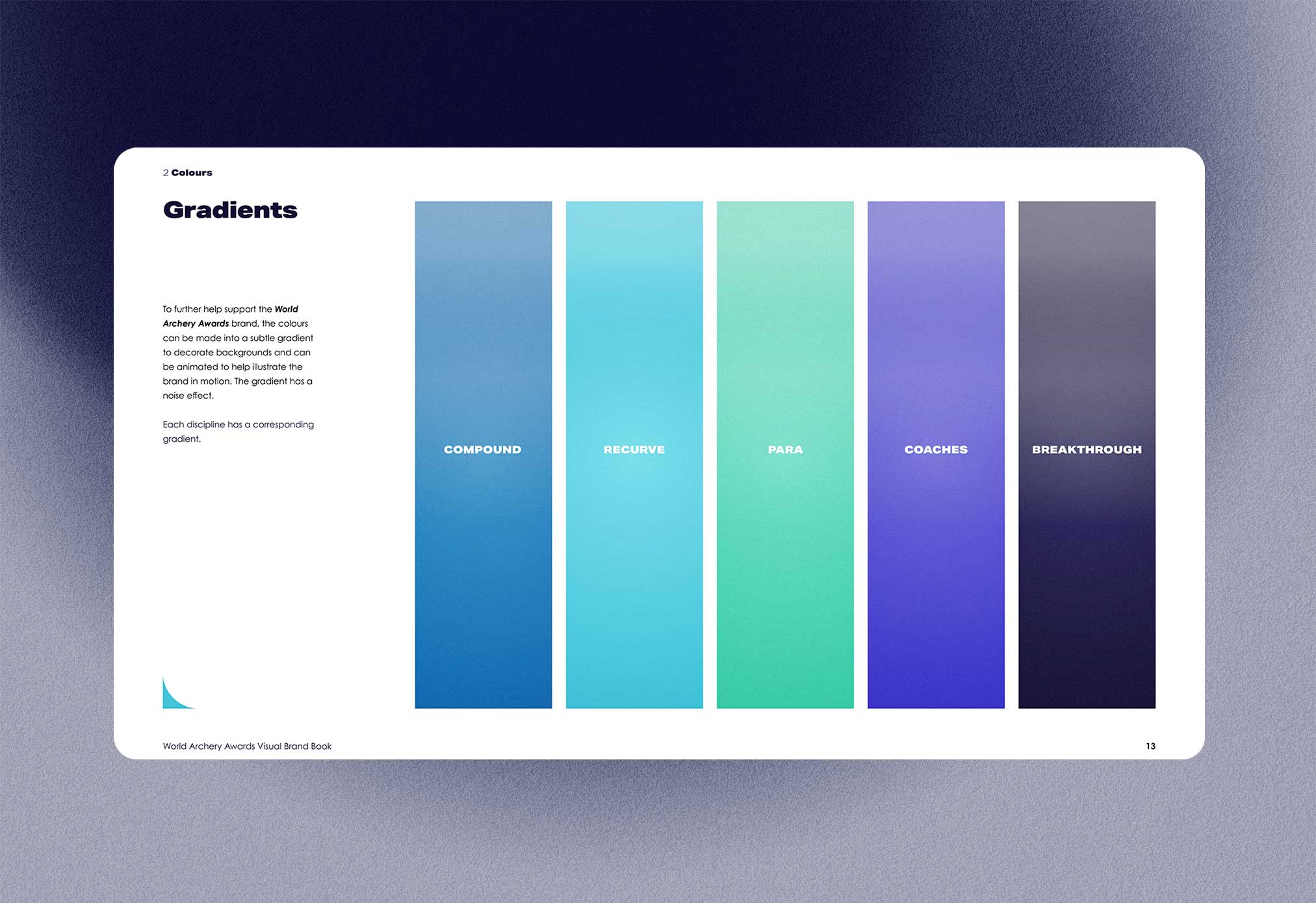
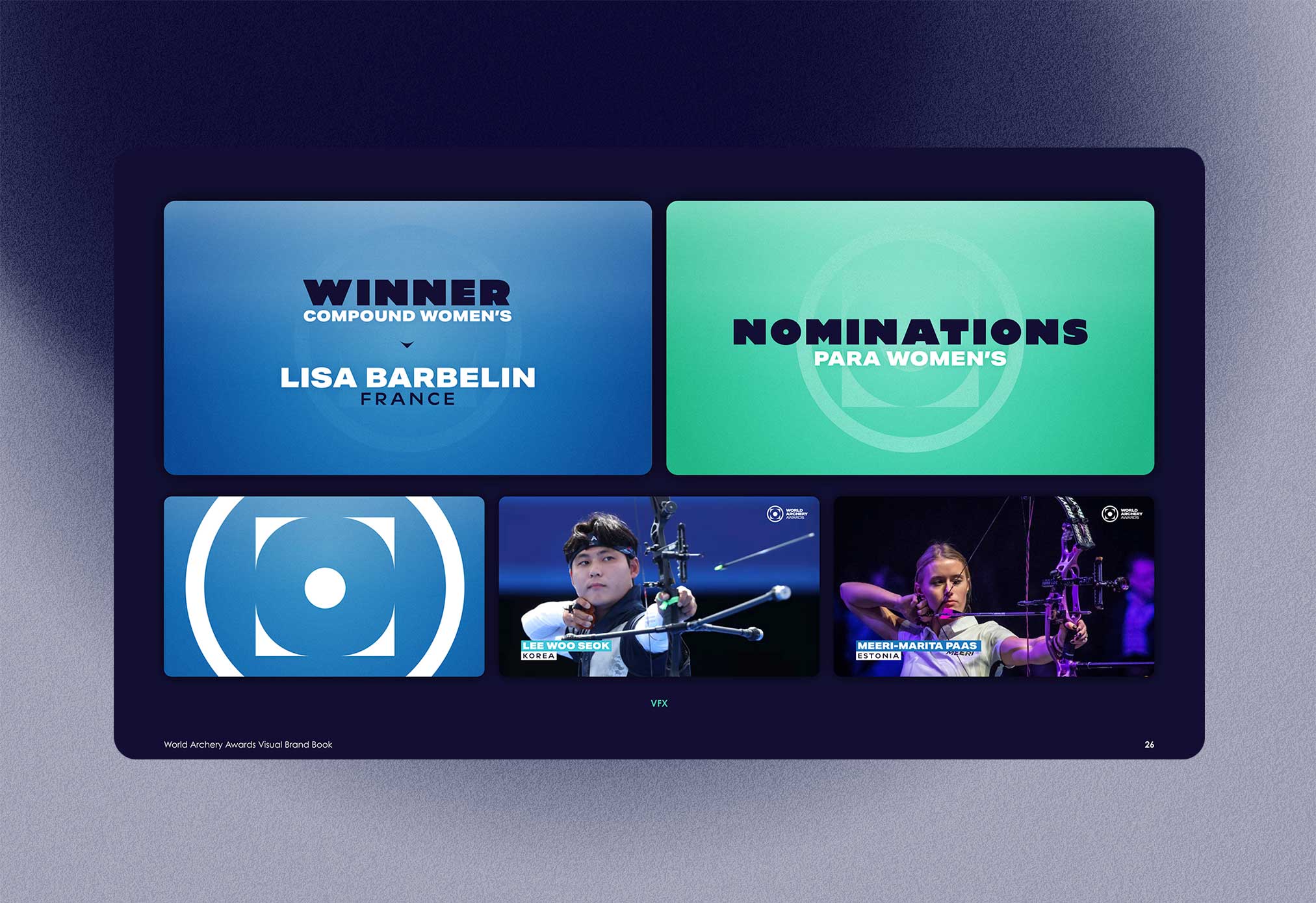
The guys at Word Archery Federation came to me to develop a brand for their annual awards. Clarity and responsivity were key as was an influence from the archery world (the target) which combined with Swiss shapes as a nod to the Federations Swiss roots.